노션 블로그 만들기 - Emotion 라이브러리? 얜 누구지?
Emotion 라이브러리에 대한 나의 생각?!
2023-02-22 | 프로젝트 | 10min
들어가며
드디어 나의 코드를 설명하는 첫 글이다. 우선 블로그 **첫 글**에서 설명했듯이 나는 Emotion 라이브러리를 이 프로젝트 이전까지는 사용해본 경험이 없었다. 오히려 비슷한 라이브러리인 styled-components 를 자주 이용해왔었다. 그런데 한 번 당시 tailwind가 뜨고 있었고 궁금증에 tailwind-css 를 사용해본 적 있었다.
tailwind-css 는 개인적으로 최고의 스타일 라이브러리라고 할 수 있을 것 같다. 사실 최고라고 말한만큼 자주 이용해본 적은 없었다. 그렇다고 하더라도, 이용하기 편리한 라이브러리들 중에서는 단연 최고라고 말하고 싶다.
내가 생각했던 이 라이브러리의 가장 이쁜 방식은 className 에 그냥 스타일을 추가해버리는 것이다. 경험하기 전까지는 이게 뭐지…? 라는 생각으로 가득찼었는데 막상 사용하면서 잠시 익숙해지고 나니 반응형 UI가 뚝딱하고 나왔던 경험은 정말 신기했다.
Tailwind-CSS vs Styled-Components
물론 이런 것들은 styled-components 를 이용하는 것도 가능했다. 다음 코드를 보자. 코드의 출처는 이곳이다.
.button {
    background-color: red;
    color: white;
    border-rounded: 3px;
    text-align: center;
}

.button:hover {
    background-color: black;
}

@media (min-width: 768px){
    .button {
        margin-bottom:4px;
    }
}
위의 css를 styled-component 를 이용하여 코드를 작성할 경우 아래와 같이 보통 작성한다.
const Button = styled.a`
	background-color: red;
	color: white;
	border-rounded: 3px;
	text-align: center;

	&:hover{
		background-color: black;
	}

	@media (min-width: 768px){
		margin-bottom:4px;
	}
`;

<Button>Click me</Button>
그리고 위를 Tailwind 로 재작성하면 다음과 같다.
<div className="bg-red-400 text-white rounded text-center hover:bg-black md:mb-4">
	Click Me
</div>
너무나 간편하지 않나? 스타일 적용하는 방법만 알아도 굳이 새롭게 styled.a``` 만들 필요 없이 className에다가 적용만 하면 끝난다. (정말 이름짓는게 어려워서 tailwind가 맘에 드는 것도 있다.styled-component` 를 이용할 때면 어떻게 이름을 생각해서 짜면 나중에 봐도 구분하기 쉽게 짤까 생각하는게 어렵다.)
Tailwind 단점
이렇게 이쁘장한 tailwind 도 물론 장점만 있는 것이 아니다. 위 코드만 봐도 한 줄이 너무 길다는 느낌을 받을 것이다. 다음은 tailwind 공식 홈페이지에 나와있는 예시이다.
Tailwind CSS - Rapidly build modern websites without ever leaving your HTML.
<main class="py-6 px-4 sm:p-6 md:py-10 md:px-8">
<div class="max-w-4xl mx-auto grid grid-cols-1 lg:max-w-5xl lg:gap-x-20 lg:grid-cols-2">
<div class="relative p-3 col-start-1 row-start-1 flex flex-col-reverse rounded-lg bg-gradient-to-t from-black/75 via-black/0 sm:bg-none sm:row-start-2 sm:p-0 lg:row-start-1">
<h1 class="mt-1 text-lg font-semibold text-white sm:text-slate-900 md:text-2xl dark:sm:text-white">Beach House in Collingwood</h1>
<p class="text-sm leading-4 font-medium text-white sm:text-slate-500 dark:sm:text-slate-400">Entire house</p>
</div>
<div class="grid gap-4 col-start-1 col-end-3 row-start-1 sm:mb-6 sm:grid-cols-4 lg:gap-6 lg:col-start-2 lg:row-end-6 lg:row-span-6 lg:mb-0">
<img src="/beach-house.jpg" alt="" class="w-full h-60 object-cover rounded-lg sm:h-52 sm:col-span-2 lg:col-span-full" loading="lazy">
<img src="/beach-house-interior-1.jpg" alt="" class="hidden w-full h-52 object-cover rounded-lg sm:block sm:col-span-2 md:col-span-1 lg:row-start-2 lg:col-span-2 lg:h-32" loading="lazy">
<img src="/beach-house-interior-2.jpg" alt="" class="hidden w-full h-52 object-cover rounded-lg md:block lg:row-start-2 lg:col-span-2 lg:h-32" loading="lazy">
</div>
<dl class="mt-4 text-xs font-medium flex items-center row-start-2 sm:mt-1 sm:row-start-3 md:mt-2.5 lg:row-start-2">
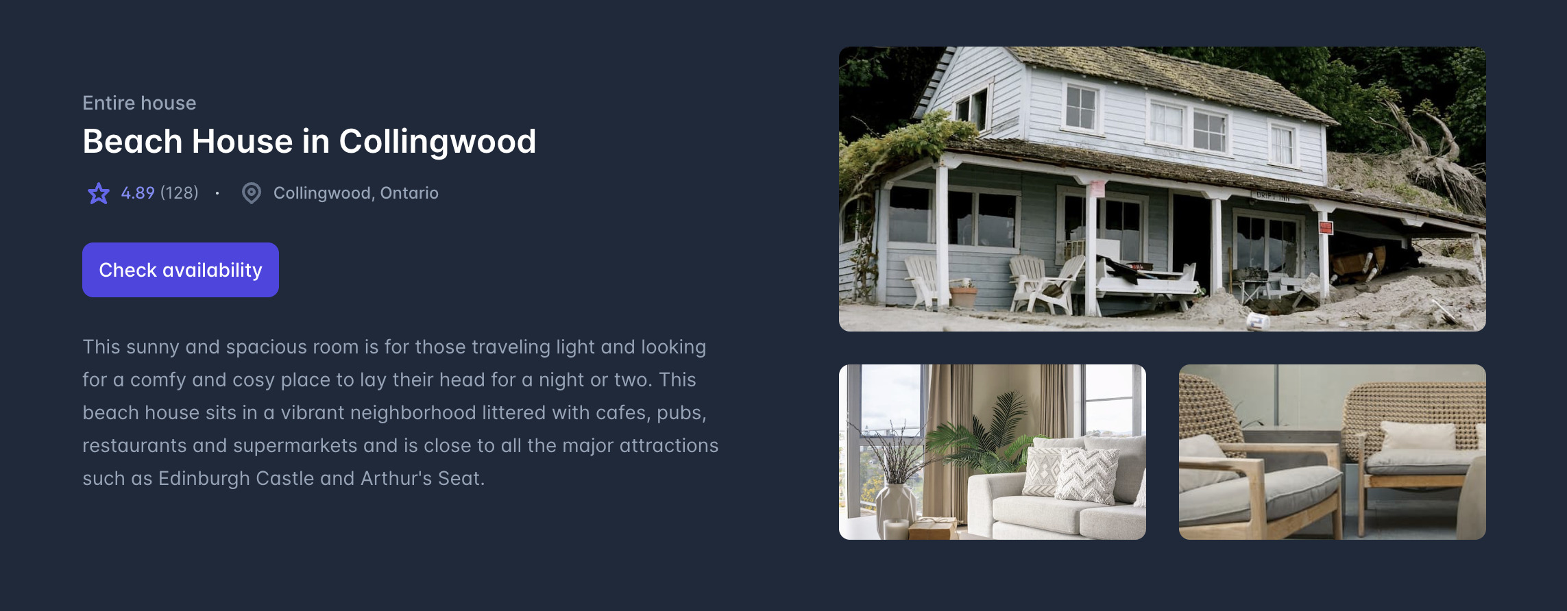
... 코드의 일부만을 따온 예시이다.위 코드가 구현하는 컴포넌트의 생김새가 다음과 같다.
물론 색에 크기에 레이아웃에 반응형까지 크기별로 조정 가능하게끔 이 짧은 코드로 구현가능하다는 것은 정말 편리한 점이지만 결국은 가독성이 문제가 된다. 이후 특정 위치의 UI를 조정하고 싶은 맘이 생긴다면 애를 먹게 된다.
즉, 유지보수 측면에서는 별로라고 생각한다.
물론! 언제나 방법은 존재한다! Tailwind-css는 아래와 같은 해결책을 제시해주고 있다.
Content Configuration - Tailwind CSS
코드만 보자.
const sizes = {
  md: 'px-4 py-2 rounded-md text-base',
  lg: 'px-5 py-3 rounded-lg text-lg',
}

const colors = {
  indigo: 'bg-indigo-500 hover:bg-indigo-600 text-white',
  cyan: 'bg-cyan-600 hover:bg-cyan-700 text-white',
}

export default function Button({ color, size, children }) {
  let colorClasses = colors[color]
  let sizeClasses = sizes[size]

  return (
    <button type="button" className={`font-bold ${sizeClasses} ${colorClasses}`}>
      {children}
    </button>
  )
}
위처럼 기존의 tailwind 문법을 직접 한 줄에 다 쓰는 것이 아닌 필요한 구성들만 따로 빼내서 이를 커스텀화 시키면 이후 유지보수에 무척 편리해지는 방법이 있다. 더 자세한 방식에 대해서는 위의 링크를 참고하길 바란다. (추후에 tailwind관련 사용기도 깊게 다뤄보고 싶다. 아니 다룰 것이다.. ~~일단 많이 써보고 나서;;~~ㅎㅎ)
Styled-Components 장단점
다시 styled-components 로 넘어가보자. 내가 생각하는 이 라이브러리의 장점은 css와 같은 방식으로 작성할 수 있다는 점이다. 그렇기에 간단한 사용법과 css를 작성할 줄 알면 언제든 적용할 수 있는 라이브러리이기에 진입장벽이 tailwind 보다는 낮다.
그리고 css형식으로 작성할 수 있다는 것은 다시말해 유지보수가 편리하다는 것이다. 게다가, 특정 컴포넌트에 기존 css방식으로 애니메이션을 넣는 등 interactive한 디자인을 세세하게 수정하는 것 또한 편리하기에 프로젝트에 바로 적용하기에 너무 좋다.
하지만 이도 장점이 있듯 단점도 있다. 아래 코드를 보자. 코딩 신생아 시절 작성한 컴포넌트의 구조이다.
<SpecificResultContainer>
  <SpecificResultAll>
    <SpecificResultCircleAndBar>
      <SpecificResultCircle>
        <SpecificCircleProgress
          CourseColor={color}
          TotalScore={TotalScore}
          MyScore={MyScore}
        />
      </SpecificResultCircle>
      <SpecificResultBar>
        <SpecificBarProgress
          CourseColor={color}
          TotalScore={TotalScore}
          MyScore={MyScore}
          satisfied={satisfied}
        />
      </SpecificResultBar>
    </SpecificResultCircleAndBar>
    <SpecificResultCourseTaken>
      <CourseListContainer>{courselist()}</CourseListContainer>
    </SpecificResultCourseTaken>
  </SpecificResultAll>
</SpecificResultContainer>
물론 이름짓기가 구성요소가 많아지다보니 어떻게든 만들어낸 방식이다. (퀄리티가 낮아보인다면 양해바란다). 위 코드의 children이 있는 부분들은 거의 styled-components 로 작성된 코드이다. 이도 가독성이 떨어진다. 대신 디자인 수정은 상대적으로 용이하다.
위는 모든 코드의 극히 일부분이기에 견딜만한 구조로 보이지만, 파일 구조가 복잡해지고 상당히 많아지면서 일반적인 div태그를 사용하고 싶다는 생각도 잠시잠시 느껴졌었다..
그래서?
그럼 tailwind와 styled-components의 절충안은 없을까? 찾아봤더니 내가 맘에 들었던 inline css를 작성가능하며 이를 css 문법을 지원주면서 한편으로 styled-components의 커스텀 태그 생성까지 가능하게 하는 라이브러리가 Emotion 라이브러리였다. NextJS와 Emotion 세팅은 어렵지 않다. 이전에 yarn berry 까지 세팅하는 것을 기억한다면 아래와 같이 커맨드를 통해 Nextjs 프로젝트를 세팅하면된다.
yarn create next-app . --typescript

yarn set version berry

yarn dlx @yarnpkg/doctor --> 의존성 검사

yarn dlx @yarnpkg/sdks vscode --> vscode를 위한 타입추론 세팅 (for yarn berry)

// 근데 난 vscode대신 webstorm ide를 사용중이라 굳이 다운받지는 않았다.

yarn plugin import typescript --> yarn에 typescript 플러그인 추가

yarn add -D typescript --> 개발 환경에서 typescript 추가

// node_modules 있으면 삭제 후

yarn
아 물론 Nextjs를 위 yarn으로 다운받은 뒤, 버전을 berry를 올리는 것이 나중이다. berry로 세팅하는 것은 이전 포스팅을 참고하길 바란다.
Emotion 설치 및 소개
다음은 Emotion 설치이다.
yarn add @emotion/react @emotion/styled위를 통해 emotion 라이브러리를 설치해준다. 위의 @emotion/styled 는 styled-component의 emotion 버전이라고 생각하면 된다.
그리고 @emotion/react 이 바로 내가 좋아하는 방식이다. 공식문서에 따르면,
The @emotion/react package requires React and is recommended for users of that framework if possible.
React나 React 프레임워크 유저들에게 추천하는데 특징으로는,
Best when using React with a build environment that can be configured.
cssprop support
- Similar to the
styleprop, but also has support for auto vendor-prefixing, nested selectors, and media queries.- Allows developers to skip the
styledAPI abstraction and style components and elements directly.- The
cssprop also accepts a function that is called with your theme as an argument allowing developers easy access to common and customizable values.- Reduces boilerplate when composing components and styled with emotion.
빌드 환경 설정에 최적임을 주장한다. → css prop에 대해서는 jsx 의 태그 내에 기본적으로 있는 style 속성과는 동일하지만 auto vendor-prefixing , nested selectors , media queries 를 적용 가능하다는 것이다.
진짜 최애 기능이다. Auto vendor-prefixing은 css 방식으로 작성하면 알아서 포맷팅을 해주는 기능이다. 더불어 해당 css 작성안 내에 nested selectors 와 media queries 또한 작성할 수 있다는 것이다. 아래 예시를 보자.
<div
    css={css`
      padding: 32px;
      background-color: hotpink;
      font-size: 24px;
      border-radius: 4px;
      &:hover {
        color: ${color};
      }
			@media (min-width: 768px){
				margin-bottom:4px;
			}
    `}
  >
위는 auto vendor prefixing의 예시이다. 위처럼 inline 방식으로 css를 작성가능하며 내부에 미디어 쿼리 문법도 지원한다는 것이다. 원래라면 styles을 통해 inline 방식을 작성할 경우 미디어 쿼리나 내부 tag를 선택하기 위해서는 string 방식으로 selector을 작성했어야 한다. (자동 완성도 안되고, syntax highlighting에 잡히지 않아서 개인적으로 순수 react의 inline 방식 작성시 별로 선호하는 방법은 아니었다.)
하지만! emotion의 css prop은 이를 가능케 한다! 🤯
게다가 이뿐만 아니라,
Server side rendering with zero configuration.
어떤 환경 설정 없이도 SSR을 지원하며,
Theming works out of the box.
원하는 컴포넌트 밖에서 css를 작성해도 옮겨올 수 있으면서
ESLint plugins available to ensure proper patterns and configuration are set.
적절한 패턴과 설정을 위한 ESlint 플러그인도 지원한다.
이러한 장점들에 더해서 내가 최애하는 기능은 바로 아래 기능이다.
<div css={css``}/> // 이런 방식으로도 작성 가능하지만

<div css={[css``, css``]} /> // 이런 식으로 중첩도 가능하다는 것이다.
위 처럼 보통 styled component를 이용할 때, styled(커스텀 생성한 태그) 방식으로 상속 받는 방식으로 만들어왔다면, emotion은 추가 되는 부분이나 덮어 쓸 부분들을 추가로 생성하여 배열 형태로 css prop에 넣을 수 있다는 것이다.
이 방식은 css 요소의 재사용성을 매우 높여주는 동시에 가독성 또한 챙길 수 있게된다. 아래 예시를 보자.
// 예시용으로 하나만 가져왔다.
const imgSkeletonStyle = css`
  width: 200px;
  height: 200px;
  background-color: #3a3d4a;
`;

<section css={linkStyle}>
	<div css={[imgStyle, imgSkeletonStyle, shimmerStyle]} />
	<section css={contentStyle}>
		<div css={[titleSkeletonStyle, shimmerStyle]} />
    <div css={[descriptionSkeletonStyle, shimmerStyle]} />
		<div css={[descriptionSkeletonStyle, shimmerStyle]} />
		<div
			css={[
		        descriptionSkeletonStyle,
            shimmerStyle,
            css`
              width: 50%;
            `,
          ]}
     />
		<section css={tagAndDateStyle}>
			<div css={[dateSkeletonStyle, shimmerStyle]} />
				<div css={tagContainer}>
					<div css={[tagStyle, tagSkeletonStyle, shimmerStyle]} />
					<div css={[tagStyle, tagSkeletonStyle, shimmerStyle]} />
					<div css={[tagStyle, tagSkeletonStyle, shimmerStyle]} />
				</div>
		</section>
	</section>
</section>
위 코드처럼 하나의 css 요소를 생성했다면, 이를 위 코드처럼 사골 육수 내듯이 우려먹을 수 있다. 게다가, 배열 방식에서 급한 스타일 변경이 필요할 때, 바로 `css``` 방식으로 스타일 추가를 할 수 있다. 아주 이쁜 방식이다.
Emotion 환경 설정
{
  "presets": [
    [
      "next/babel",
      {
        "preset-react": {
          "runtime": "automatic",
          "importSource": "@emotion/react"
        }
      }
    ]
  ],
  "plugins": ["@emotion/babel-plugin", "inline-react-svg"]
}
위를 최상위 디렉토리에 .babel.rc 파일을 만들어 위 내용을 추가한다.
이 글을 작성하면서 찾아보니 최근에는 바벨 컴파일러의 도움 없이도 next 자체 컴파일러에서 이를 지원해준다는 사실을 발견하게 되었다
Advanced Features: Next.js Compiler | Next.js
위 공식문서에 따라 next.config.js 파일에 아래 정보를 추가하면 된다.
각각에 대해 자세하게 설명되어 있으니 참고하길 바란다.
// next.config.js

module.exports = {
  compiler: {
    emotion: boolean | {
      // default is true. It will be disabled when build type is production.
      sourceMap?: boolean,
      // default is 'dev-only'.
      autoLabel?: 'never' | 'dev-only' | 'always',
      // default is '[local]'.
      // Allowed values: `[local]` `[filename]` and `[dirname]`
      // This option only works when autoLabel is set to 'dev-only' or 'always'.
      // It allows you to define the format of the resulting label.
      // The format is defined via string where variable parts are enclosed in square brackets [].
      // For example labelFormat: "my-classname--[local]", where [local] will be replaced with the name of the variable the result is assigned to.
      labelFormat?: string,
      // default is undefined.
      // This option allows you to tell the compiler what imports it should
      // look at to determine what it should transform so if you re-export
      // Emotion's exports, you can still use transforms.
      importMap?: {
        [packageName: string]: {
          [exportName: string]: {
            canonicalImport?: [string, string],
            styledBaseImport?: [string, string],
          }
        }
      },
    },
  },
}
추가로 지금까지의 모든 과정들에 대해 잘 정리된 다음 글을 추천한다.
NextJS(TS) + Yarn berry boilerplate 생성
결론
이렇게 여러 css 라이브러리들의 내가 생각하는 장단점 및 Emotionjs의 장점들과 선택하게 된 이유, 환경 설정 및 적용 방법에 대해서 알아보았다. 사실 작성하고 싶은 내용은 무척 많은데 글이 너무 길어지는 것 같아 보이기에 한텀 끊어서 가볼까 한다.
다음으로는 prettier-eslint 세팅에 대해서 알아본 뒤, Notion 공식문서에서 제공하는 api에 대해서 프로젝트에 필요한 부분들에 대해서 설명할 예정이다.